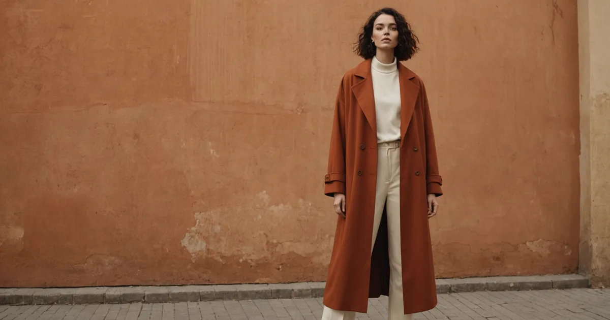
The most common wardrobe problem I encounter in styling work is not that someone owns bad clothing. It is that they own one or two genuinely interesting pieces that are not getting worn because the rest of their wardrobe does not support them. The statement piece sits in the closet because every time they pull it out, they cannot figure out what it goes with. Eventually it stops getting pulled out at all.
This is a solvable problem, but the solution requires understanding what a statement piece is actually asking for from the rest of the outfit, which turns out to be different depending on what kind of statement the piece is making. Here is the framework I use.
First, identify what the piece is doing
A statement piece can make its statement in several distinct ways, and the support it needs depends on the type. The most common types are: color, construction, silhouette, and texture. Some pieces combine more than one, which is where the real difficulty starts.
A piece making a color statement, a bright coat, a deep jewel-toned trouser, a printed top, is asking for everything else in the outfit to step back and give it room. The supporting pieces should be quiet in color and neutral in construction. Any competition in the color register fragments the look and makes the whole thing harder to read. This is why the obvious pairings often work: a vivid piece over a white shirt, a strong-colored trouser with a simple cream or charcoal top. The obviousness is a feature. The statement piece is doing the work. The other pieces are creating space for it to do so.
A piece making a construction statement, a jacket with unusual seaming, a blouse with structural pleating, a coat with an architectural shoulder, needs different support. Here, color coordination is less important than maintaining the construction language. Pieces that compete with elaborate construction details in their own right create visual noise. The supporting pieces should be simple enough in construction that they do not distract from what the statement piece is doing technically.
Silhouette statements require the most deliberate support
Of all the statement types, silhouette is the one that most consistently trips people up. A piece with an unusual or dramatic silhouette is the easiest to buy on impulse and the hardest to wear, because every other piece in the outfit affects how the silhouette reads.
The basic principle: a dramatic silhouette in one part of the outfit typically requires a counterbalancing simplicity elsewhere. Wide-leg, high-volume trousers are a classic example. Worn with an oversized, volume-heavy top, the whole outfit becomes visually heavy and the trouser silhouette, which was the point, gets lost. Worn with a clean-lined, fitted top that anchors the upper body, the trouser silhouette reads clearly and the contrast does the interesting work.
The corollary is that when the silhouette statement is in the top, the bottom should typically provide the anchor. A sculptural jacket or a top with unusual volume needs trousers or a skirt that sit close to the body and read as neutral in silhouette terms. Otherwise you are stacking volume on volume, and neither element can do what it was designed to do.
The mistake people make is thinking that dramatic pieces go together. That logic works in a mood board where you are building a feeling rather than an actual wearable outfit. In practice, drama needs contrast. The things around the statement piece need to be decided enough in their own quiet way that the statement piece reads against them, not alongside them.
Texture statements and why they are more forgiving
Texture is the most forgiving of the statement types because it does not compete with itself the way color and silhouette do. Two pieces with interesting texture can often coexist in the same outfit more comfortably than two statement colors or two dramatic silhouettes, as long as the textures are in conversation rather than in conflict.
Texture contrast tends to work better than texture repetition. A heavily textured knit worn with a smooth, tightly woven trouser creates a productive contrast: the eye moves between the surfaces and finds the relationship interesting. The same heavily textured knit worn with a loosely woven linen in a similar visual weight starts to compete for attention in the same register and the outfit reads as busy.
The practical guidance: if a piece's primary statement is textural, the supporting pieces should be smooth enough to provide contrast, and their color should not be working against the texture by creating its own competing interest. A single-interest outfit, where only one element at a time is doing something visually interesting, is almost always stronger than a multi-interest outfit where everything is competing to be noticed.
When a piece combines types
Pieces that make simultaneous statements in color, construction, and silhouette are the hardest to wear and are usually the ones sitting unworn longest in people's closets. A deeply colored, elaborately constructed piece in a dramatic silhouette has no easy foil. Everything you put with it will either compete with it or look like an afterthought.
My approach with these pieces is to treat the outfit as built entirely around them, with every other element reduced to as close to neutral as possible across all three registers simultaneously. That means the supporting pieces are quiet in color, simple in construction, and conventional in silhouette. They exist to establish that you are a dressed person, not to make any contribution of their own. The statement piece earns all of that space, but it has to actually earn it, which means it has to be genuinely interesting enough to hold the attention without support.
Not every piece that seemed interesting in the shop is actually interesting enough to carry an outfit at that level. Some pieces need support. Some pieces need space. The honest assessment of which category your statement piece falls into is the starting point for building an outfit around it successfully.
The practical version for everyday dressing
I am not suggesting that every outfit requires this level of analysis. Most daily dressing decisions are made quickly and should be. But when you have a piece that is genuinely not getting worn despite being something you care about, it is worth slowing down to identify what kind of statement it is making and what that statement is asking from the rest of the outfit. Usually that analysis reveals one or two specific gaps: a missing neutral trouser in a particular silhouette, a top that is too busy to let the jacket do its work, a footwear choice that reads the wrong register.
That is the level at which the Atorie outfit suggestions are most useful: not as complete wardrobe prescriptions, but as context for how a piece from an independent label might work within a wardrobe you are already building. The piece you are seeing is being shown alongside other elements that are calibrated to let it do its specific kind of work. Whether those exact supporting elements are right for your wardrobe is secondary to whether the logic they demonstrate is useful to you.